
A staircase can set the tone for an entire outdoor space. Get the colour right and everything else seems to fall into place; get it wrong, and it nags at you, even if you can’t quite say why. When working with concrete step treads, the choice isn’t just aesthetic. It’s shaped by light, materials, use, and a few practical realities that tend to show up later rather than sooner.
How Surrounding Materials Shape Your Colour Direction
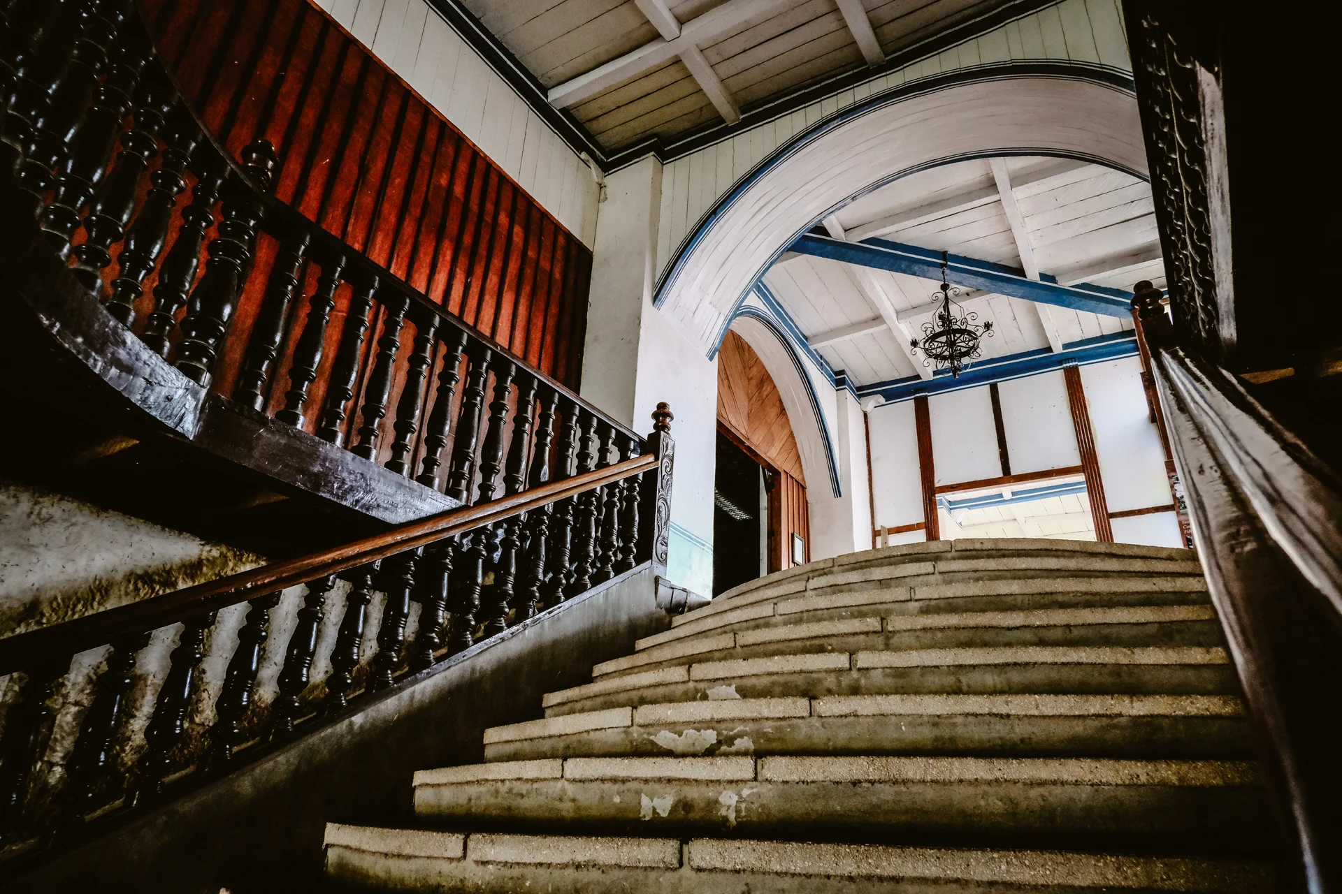
No set of steps stands alone. They borrow meaning from whatever sits nearby, whether that’s a rendered wall, a timber deck, or a stretch of exposed aggregate driveway. The colour you choose has to hold its own in that company.
Cool-toned homes often lean towards greys that carry a hint of blue or charcoal. It keeps things consistent without trying too hard. On the other hand, a house wrapped in warm brick or timber usually calls for something softer. Sandy hues, pale browns, even a washed limestone look. These tones echo what’s already there, rather than cutting across it.
It’s less about matching everything exactly and more about avoiding a clash. A staircase should feel like it belongs, not like it arrived later with its own agenda.
Why Sunlight And Heat Change The Equation Completely
Colour can shift in so many ways once the sun hits it. That’s where things get practical. Lighter treads reflect more light, which keeps them noticeably cooler underfoot. In places that see long, hot summers, it can change everything. Nobody wants to tiptoe across scorching steps in bare feet. Darker shades, though undeniably striking, absorb heat quickly. They look sharp in the morning and feel like a hot plate by mid-afternoon.
There’s also the question of glare. Very pale surfaces can bounce light around in a way that feels harsh, particularly in open areas. A slightly muted tone often strikes a better balance. Not too bright, not too heavy.
The Reality Of Dirt Wear And Everyday Use
Freshly installed steps always look their best. Clean lines, even colour, no marks. That moment doesn’t last. Dust settles, leaves break down, and shoes carry in whatever the garden throws up. Lighter colours show everything. Every footprint, every smudge. Darker ones hide some of it but reveal other things, like water marks or faded patches over time.
This is where mid-tones can come in handy. Greys with a bit of depth, earthy blends with slight variation. They don’t demand constant attention, and they age with a bit more grace. And then there’s weathering. Even well-made materials shift slightly as they’re exposed to the sun and rain. Choosing a colour that still looks good after that soft fade can save you from disappointment later.
Making Sure Safety And Visibility Are Not Afterthoughts
It’s easy to focus on how a staircase looks from a distance. Up close, function takes over. Each step needs to be clearly defined. If the tread and riser blur into one another, it becomes harder to judge depth, especially in low light. That’s where contrast comes in. It doesn’t have to be dramatic, just enough to signal where one level ends and the next begins.
This matters even more in outdoor settings where shadows shift throughout the day. A well-chosen colour can make navigation feel instinctive. A poor one forces people to slow down and second-guess their footing.
Letting The Landscape Guide The Final Palette
Deep greys and slate tones often anchor lush gardens, giving all that green something to push against. The contrast can be striking without feeling forced. In lighter, more open landscapes, softer tones tend to work better. They echo sand, stone, and sky, creating a sense of continuity.
Additionally, a smooth finish reads differently from a textured one, even if the colour is the same. Rougher surfaces catch light in small variations, adding depth and a slightly more natural feel. It’s subtle, but it changes how the colour is perceived.
Using Colour To Influence How Space Feels And Flows
There’s a psychological side to all this that doesn’t get talked about enough. Darker steps tend to feel solid, grounded. They can make a long run of stairs feel shorter, more contained. Lighter ones do the opposite by opening things up, making tight spaces feel less confined.
It’s not an exact science, but the effect is real. A narrow side path can feel more generous with lighter treads. A broad, open staircase can gain a bit of presence with something darker. These are small adjustments, yet they shape how people move through a space, almost without noticing.
Takeaways
Choosing the colour of your stair treads involves a series of small judgements layered together. How does it sit with the house? How does it handle the sun? How does it look after a season of use?
There’s no perfect shade waiting to be discovered. Just the one that fits best with everything around it and holds up over time. Get that balance right, and your stairs will always look good and practical.
