Key Takeaways
- Turquoise pairs beautifully with gold for a touch of luxury.
- Coral adds a vibrant pop, perfect for lively settings.
- Gray offers a modern contrast that balances the brightness of turquoise.
Turquoise is a captivating hue that brings together the calmness of blue and the freshness of green. It’s a color that can transform a space or an outfit, making it feel vibrant and inviting. But what colors go with turquoise?
This guide will show you how to pair turquoise with various shades, creating stunning combinations for your home decor, fashion, and more. Whether you want something bold or subtle, we’ve got you covered with ideas that will inspire your creativity.
Understanding Turquoise and Its Versatility
The Nature of Turquoise
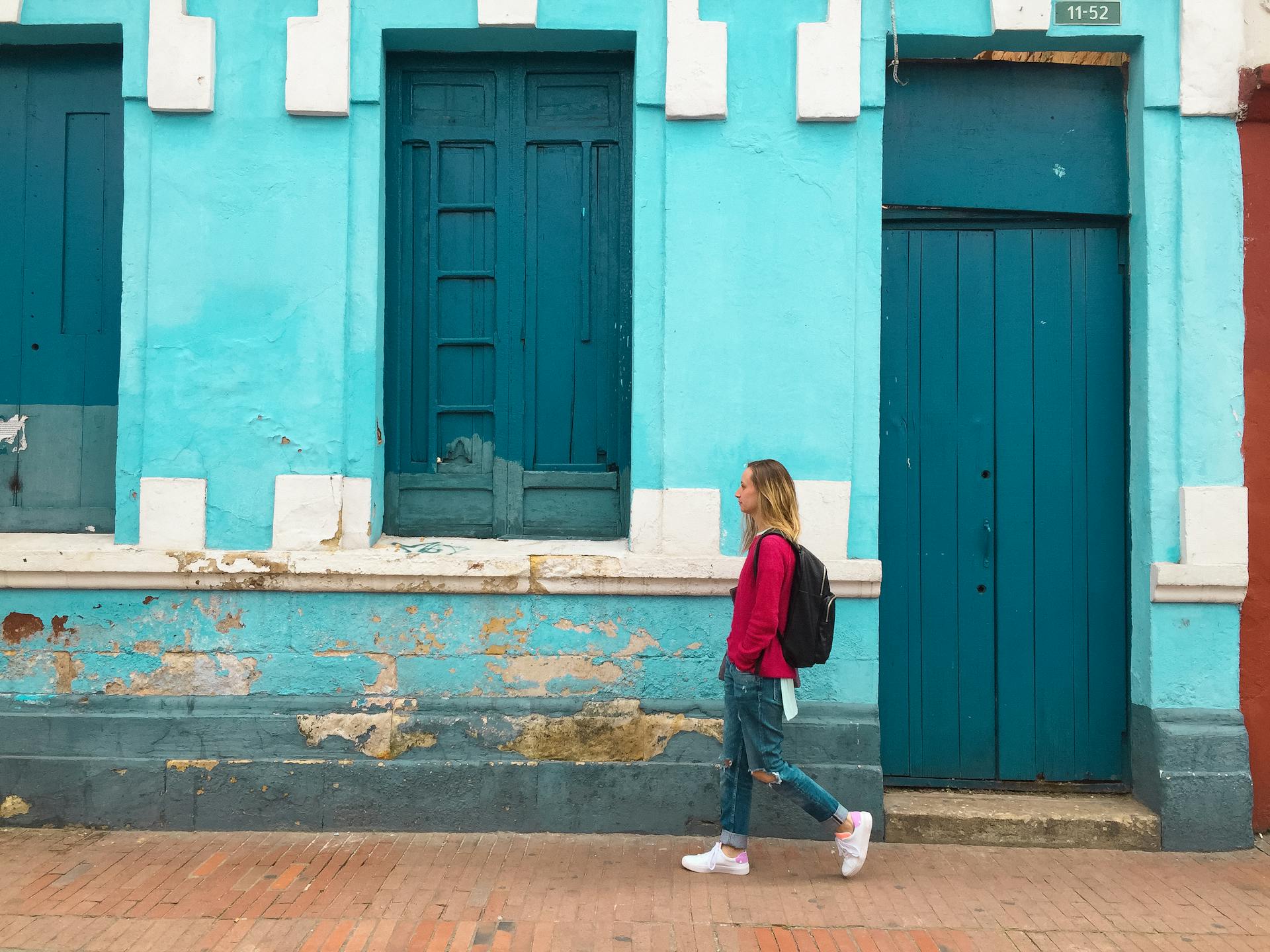
Turquoise is more than just a pretty color; it’s a whole vibe. It’s that mix of blue and green that reminds you of the ocean on a sunny day. It’s a color that can be both calming and invigorating, which is pretty cool when you think about it. It’s not just one shade either; you get everything from a bright, almost electric turquoise to a more muted, earthy tone. This range makes it super adaptable for all sorts of uses, from fashion to home decor.
Why Is Turquoise Such A Popular Color?
Colors have a way of making us feel things, right? Turquoise is no exception. It’s often linked to feelings of peace, tranquility, and even a bit of optimism. Think about it: when you see turquoise, you might think of a tropical vacation or a clear, blue sky. It’s a color that can lift your spirits and create a sense of calm. But it’s not just about relaxation; turquoise can also inspire feelings of creativity and energy. It’s a color that can help you feel balanced and refreshed.
Meaning Of Turquoise
Turquoise is often associated with open communication and clarity of thought. It’s believed to promote empathy and compassion, making it a great color to have around when you need to connect with others or just want to create a more harmonious environment.
Complementary Colors for Turquoise
Gold for Elegance
Okay, so gold and turquoise? It’s a total power couple. Think of gold as the fancy friend that turquoise brings to the party. It just elevates everything. We’re not talking gaudy, over-the-top gold, but more like subtle accents.
Maybe gold picture frames against a turquoise wall, or gold hardware on turquoise cabinets. It adds warmth and a touch of luxury that makes the space feel super sophisticated. Imagine a dining room once, deep turquoise walls, gold light fixture, sounds stunning, right? You can add gold elements to your design for a rich, inviting aura.
Coral for Vibrancy
Coral and turquoise together? It’s like a tropical vacation in a color scheme. It’s bold, it’s fun, and it’s definitely not for the faint of heart. We think this combo works best when you want to create a space that feels energetic and lively.
Imagine a turquoise sofa with coral throw pillows, or a piece of art that combines both colors. It’s a great way to add some personality to a room. I’ve been seeing this combo a lot in beach houses, and it just screams summer.
Gray for Modernity
If you’re going for a more modern, sophisticated vibe, gray is your go-to. Gray provides a cool, neutral backdrop that really lets the turquoise shine. It’s all about balance. You don’t want the gray to overpower the turquoise, but you also don’t want the turquoise to feel out of place. Think in the lines of a light gray wall with turquoise accents, like a vase or a piece of furniture.
Or, you could do a turquoise wall with gray furniture. It’s a really versatile combination that can work in any room. Here’s a few things to keep in mind:
- Keep the gray light to avoid a depressing space.
- Use different shades of gray for depth.
- Add texture to both colors to keep it interesting.
Analogous Colors That Enhance Turquoise
Analogous colors are those that sit next to each other on the color wheel. When it comes to turquoise, using analogous colors can create a harmonious and visually pleasing effect. These combinations are generally easy on the eyes and offer a sense of balance.
Teal and Aqua for Monochromatic Looks
Teal and aqua are natural partners for turquoise. They create a monochromatic effect that’s far from boring. Think of it like the ocean meeting the sky – a seamless transition of blues and greens. You can play with different shades and textures to add depth and interest to your design. For example, a turquoise belt paired with teal trousers can create a stylish, monochromatic look.
Sea Green for a Soft Blend
Sea green offers a softer, more muted take on the turquoise palette. It’s a gentle color that blends beautifully with turquoise, creating a calming and serene atmosphere. This combination is perfect for spaces where you want to evoke a sense of peace and tranquility. It’s like a breath of fresh air, bringing the outdoors in.
Mint for a Fresh Touch
Mint is another excellent analogous color for turquoise. It adds a touch of freshness and vibrancy to the mix. The combination of turquoise and mint is light, airy, and perfect for creating a cheerful and inviting space. It’s like a spring morning, full of promise and energy. Consider using mint accents in a room with accent walls with turquoise to brighten the space.
Using analogous colors with turquoise is a safe bet if you’re unsure about bolder combinations. They create a sense of harmony and balance, making them ideal for creating a relaxing and inviting atmosphere. Experiment with different shades and textures to find the perfect combination for your space or style.
Bold Combinations with Turquoise
Sometimes you want to make a statement, right? That’s where bold color combos come in. Turquoise is surprisingly versatile and can hold its own with some strong colors. It’s not just for beachy vibes; it can be edgy, sophisticated, or just plain fun.
Turquoise and Black for Drama
Black and turquoise is a classic pairing for a reason. The dark, grounding effect of black really makes the turquoise pop. Think of it like this: black is the stage, and turquoise is the star. You can use this combo in so many ways. A black dress with turquoise accessories is always a winner. Or, in your living room, try a black sofa with turquoise throw pillows. It’s dramatic, but not overwhelming.
Turquoise and Navy for Depth
Navy is like black’s more relaxed cousin. It’s still dark and sophisticated, but it has a softer feel. When you pair navy with turquoise, you get a sense of depth and richness. It’s a great combo for creating a space that feels both calming and luxurious. Imagine a navy accent wall with turquoise artwork? Yes, please!
Turquoise and Yellow for Cheerfulness
Okay, this one is all about bringing the sunshine. Yellow and turquoise together are like a burst of energy. It’s a playful, happy combination that’s perfect for spaces where you want to feel uplifted.
This pair is great as a kitchen combo. Walking into a bright colored kitchen of turquoise and yellow is perfect to brighten up each morning, making you feel maximized for a new day!
Here are some ideas:
- A yellow front door with turquoise planters.
- Turquoise walls with yellow accents.
- Yellow and turquoise patterned fabrics for curtains or cushions.
Creating a Calming Atmosphere with Turquoise
Turquoise is great for making a space feel calm. It’s all about using the color in the right way to bring out those tranquil vibes. It’s not just about slapping some paint on the walls; it’s about creating a feeling.
Turquoise and White for Serenity
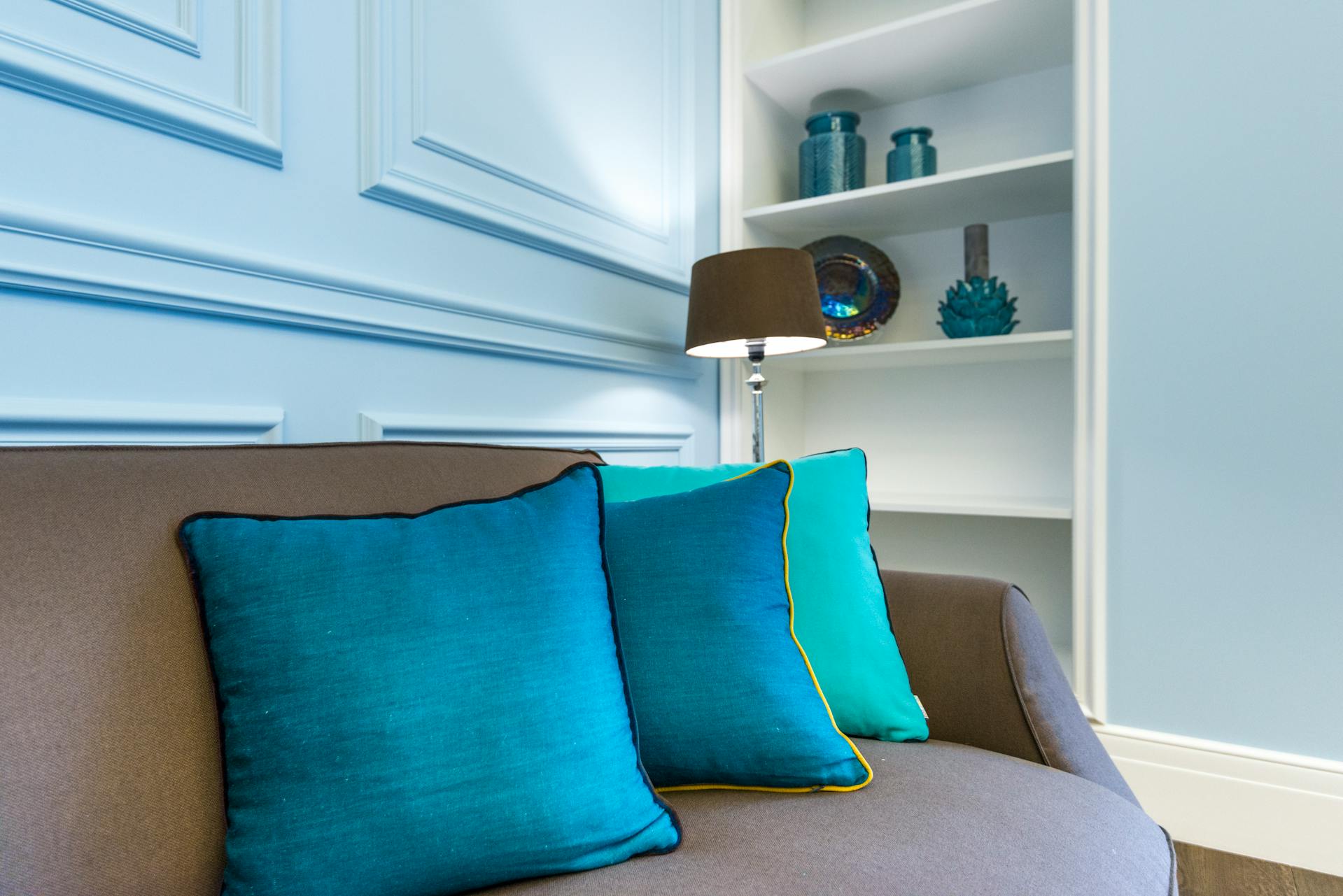
White and turquoise is a classic combo for a reason. It’s like a breath of fresh air. Think white walls with turquoise accents – cushions, throws, or even a piece of art. It’s clean, simple, and super relaxing. You can’t go wrong with this pairing if you’re aiming for a serene space. It’s also easy to add to, and easy to change if you want to try something new. Consider turquoise accents to enhance the calming effect.
Turquoise and Cream for Warmth
Cream adds a touch of warmth that white sometimes lacks. It softens the turquoise, making the space feel cozy and inviting. Imagine cream-colored walls with turquoise furniture or accessories. It’s like a warm hug on a cloudy day. It’s also a great way to balance out the coolness of turquoise, especially in rooms that don’t get a lot of natural light.
Turquoise and Beige for Subtlety
Beige is the unsung hero of calming color schemes. It’s subtle, understated, and lets the turquoise shine without being too overpowering. Think beige walls with turquoise rugs or curtains. It’s a sophisticated way to incorporate turquoise without making it the center of attention. It’s also a great option if you want a space that feels grounded and balanced.
Using Turquoise in Interior Design
Accent Walls with Turquoise
Thinking about adding a pop of color? An accent wall in turquoise can really transform a room. It’s a bold move, but it pays off by creating a focal point. Just be careful not to go overboard; too much turquoise can be overwhelming. Maybe balance it with some neutral tones to keep things chill.
Turquoise in Coastal Decor
Turquoise is practically made for coastal decor. It just screams beach vibes, right? Think about pairing it with whites, creams, and maybe some sandy beiges. You could use turquoise for:
- Throw pillows
- Curtains
- Artwork featuring seascapes
Using natural textures like jute or seagrass can really drive home that coastal feel. It’s all about creating a space that feels light, airy, and reminiscent of the ocean.
Mixing Turquoise with Neutrals
If you’re a bit hesitant about going all-in with turquoise, mixing it with neutrals is a safe bet. Gray, beige, and white all work wonders. A turquoise sofa against a gray wall? Yes, please! Or how about some turquoise accessories in a mostly white room? It’s a great way to add a splash of color without overwhelming the space. Here’s a quick look at how different neutrals can affect the vibe:
| Neutral Color | Effect with Turquoise |
| White | Fresh, clean, and airy |
| Gray | Modern and sophisticated |
| Beige | Warm and inviting |
Make a Statement With a Turquoise Front Door
Let turquoise set the tone before guests even step inside. A turquoise front door adds curb appeal and charm, especially against neutral exteriors like gray, white, or beige.
Curb Appeal Tip: Frame your turquoise door with greenery and neutral-toned planters for a harmonious, eye-catching entry.
Turquoise Kitchen Island
White kitchens are timeless—but they can sometimes lack character. A turquoise kitchen island breaks the monotony and adds a splash of personality. Combine with oil-rubbed bronze or brass hardware and a wood countertop for a warm, inviting kitchen.
Bonus: It’s easier and cheaper than replacing all your cabinetry.
Wrapping It Up
So there you have it! Turquoise is such a fun color that can really brighten up any space or outfit. Whether you go for gold for a touch of glam, or coral for that tropical vibe, the options are endless. Gray and navy blue can give a nice modern twist, while yellow adds a cheerful pop. Don’t be afraid to mix and match these colors in your home or wardrobe. With a little creativity, you can make turquoise shine in all sorts of ways. So grab those paint swatches or your favorite clothes and start experimenting. You might just find the perfect combo that makes you smile!
